###Note
Currently out of date, update soon to come
The 2018 site is the most recent one and since I've graduated, it is now only available at taw2018.netlify.app for more details
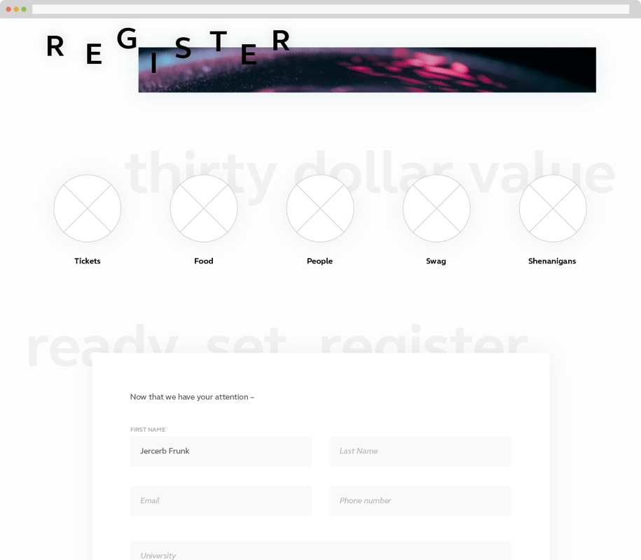
####The Project Creation of a design conference website. Tasked with forming a team and building a design conference website from ground up. The Thought at Work Design Conference 2017 website is a project completed with dozens of late nights spent on it.
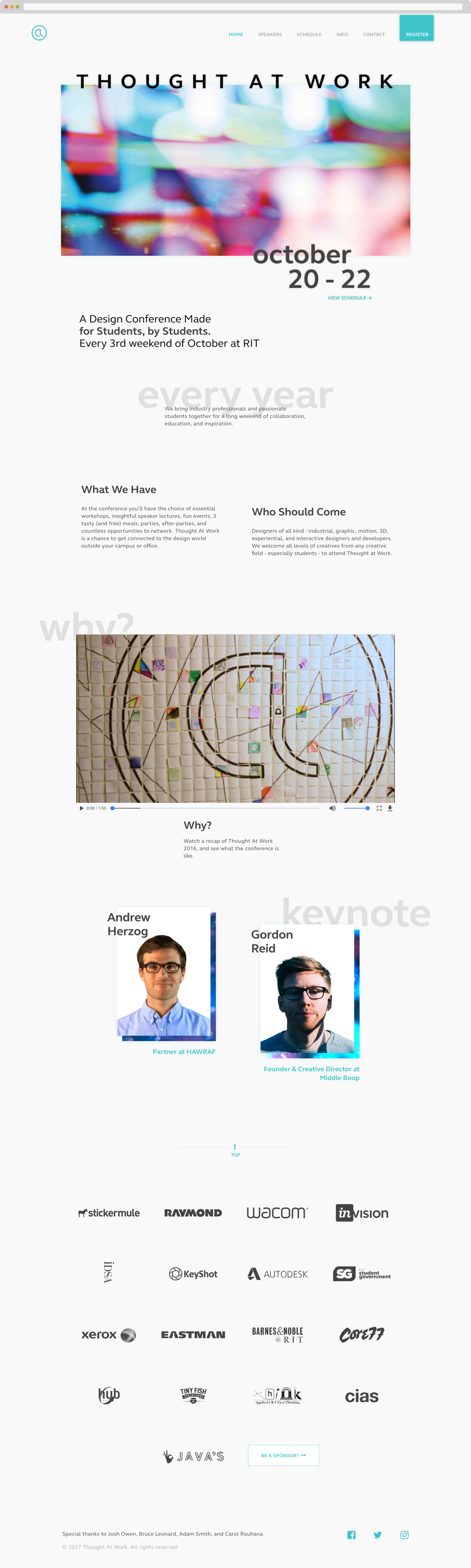
####The Tasks Undertaken Project manager, lead developer and member of the design team for the Thought at Work 2017 Design Conference website. Building on what I learned as the lead developer on Thought at Work 2016, I formed a team with the best designers and developers at RIT. Our team was made up of 12 students; 7 designers, 5 developers. My responsibilities consist of, but are not limited to: Managing the team; Leading design/development meetings; Working on design deliverables; And writing code for development.
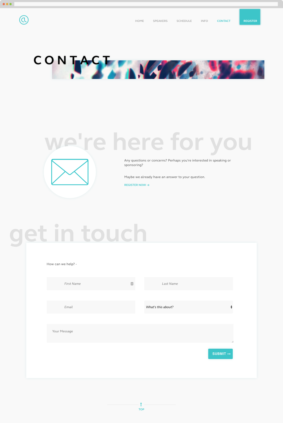
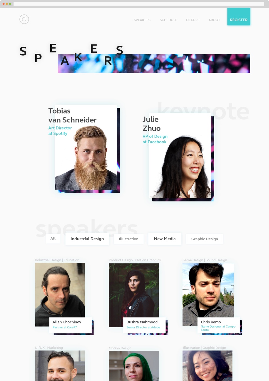
####Some Comps for the 2017 site are below
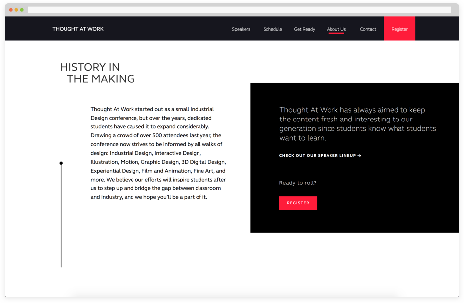
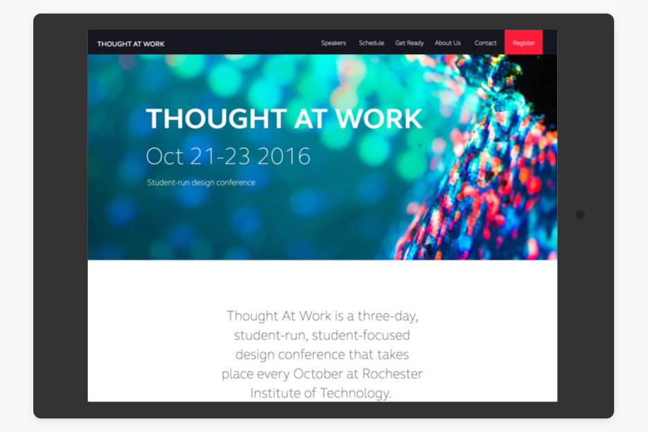
####Thought at Work 2016 Completed the development of a design conference website. Initially a member of the development team and transitioning to leading the development and executing on the website.
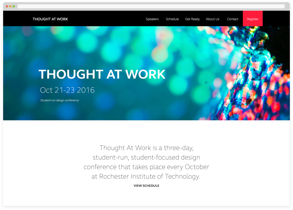
####About I’ve been involved with the ‘Thought At Work’ design conference for nearly two years in several roles, including work on the core conference team, contacting speakers, helping create installations, and most recently, building the website.
In mid-July we received the first homepage mock, followed by additional pages in the coming weeks. We used a combination of Bootstrap, our own custom CSS, PHP, JavaScript for some interactions, and JQuery for a handful of animations. I developed most of the site at first. As other people came on board, I took on a additional managerial role for the entire website and became the lead for the project.
####Responsivity At first we were only given desktop mocks for the site. Two months later we got a mobile mock of the homepage. Without a tablet mock I translated the desktop site to tablet and mobile without compromising the original style and flow of the site content. From a visual perspective the site lost some of its more interesting aspects. But it retained much of the way the content was laid out and that’s what mattered most.
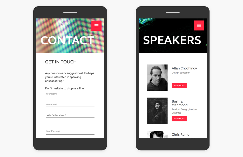
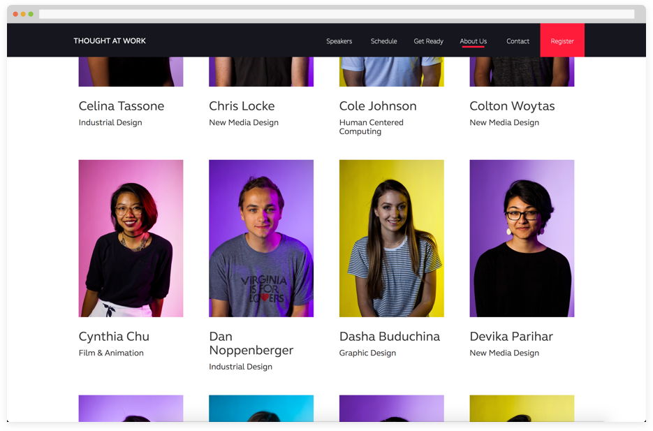
####Performance We encountered another challenge very close to the start of the conference. We were given headshots to create a volunteer/team section on the ‘about’ page. We had to display dozens of people with their name and major without losing much performance and load time.